
Filament Games Rebrand.
contributions.branding
art direction
graphic design
UI/UX
animation
illustration
Problem.Shortly after arriving at Filament Games, the studio wanted to update their branding and visual style to better reflect their desired market and modernize their appearance
Background.
Clarifying the brand positioning.Before doing any design, I interviewed the partners and senior staff members to understand their view of the brand and how they portrayed the company.
Common description words from these interviews were:
playful. friendly. authentic. innovative.
a split target audience.For many years, Filament Games targeted projects in K12 settings. While this was still a part of the audience, there was a growing market in adult education.
This presented a challenge for the rebrand. Two very different markets were emerging and we needed to represent both: a playful kids market and a professional adult market.
New Branding.
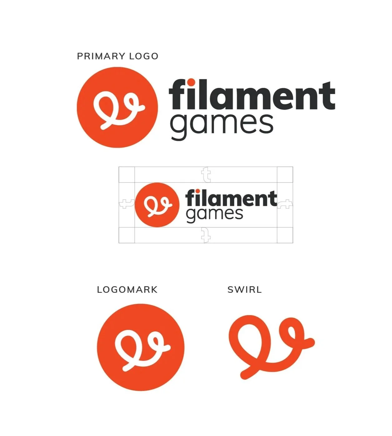
Leveraging existing brand capital.Filament Games is a well-known name in the relatively small educational video games space. To keep brand recognition, we reused the swirl, but enclosed it in a more playful circular shape. We modernized the type and layout to make it more readable and easier to use.

Building a brighter color palette.The original color palette was dark and muted and did not feel like it matched the company’s description words.
While the whole color palette was brightened, the red and black were specifically targeted. We added a blue color to the primary palette to help offset the harshness of the red.
The secondary palette was developed primarily to create a wider range of options for illustrated elements and is not used in the main branding.
the blog.
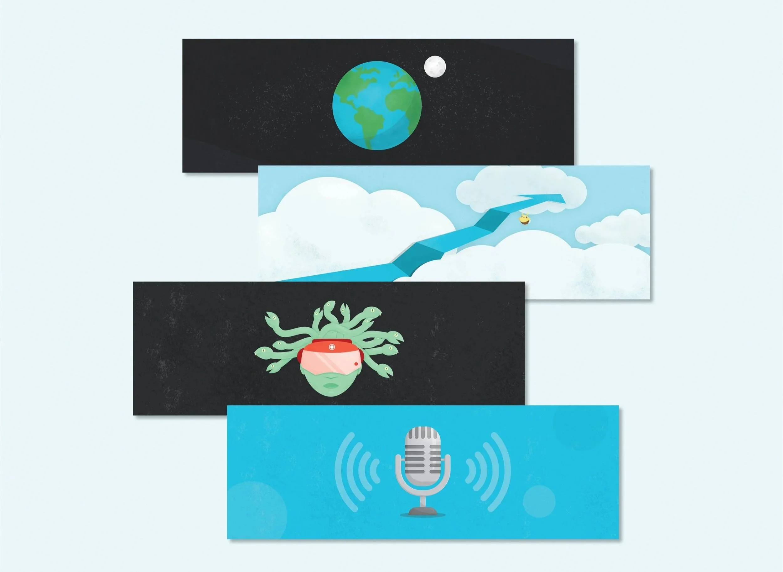
Illustrating for the blog.The Filament Games blog is a key component in company marketing. For years, each blog post came with an illustrated header image from a library of images.
We expanded on the library and updated the imagery to include more texture, better resolution, and more interesting visual concepts.
social media.

Small team efficiency defined our process.Due to the small size of the marketing team, efficiency was a key component when developing social media. All blog headers were designed so that they could easily be cut into square social media posts.
When time was available, we invested in building social animations to keep up with social media trends. These were also built from blog post illustrations.