Across karman interactive
contributions.concepting
art direction
UI/UX
illustration
animation
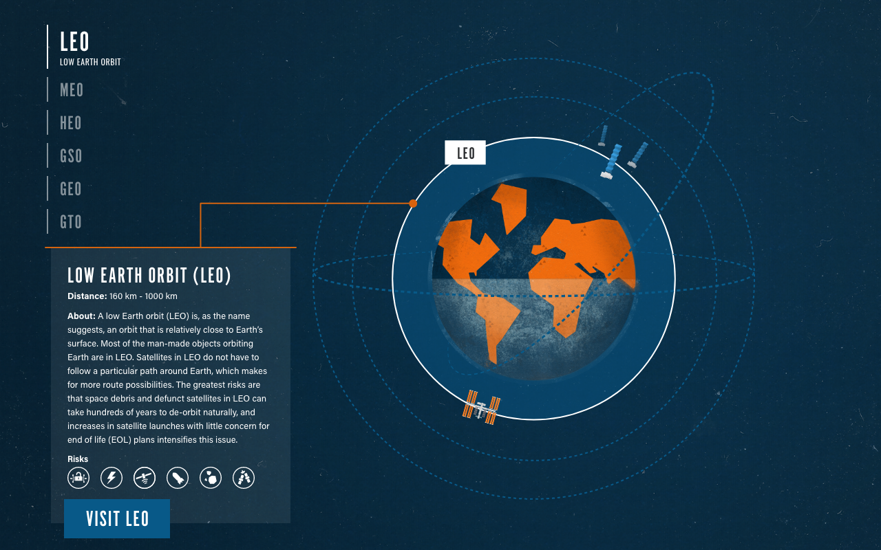
Problem.The Wilson Center team wanted to create an interactive explainer for their website to describe what we put in space and why we put it where we do. The interactive had to show the satellites and orbit models as accurately as possible.
solution.From the Across Karmen team, we learned that orbit location plays an impact on the use of satellites and the risks experienced. Additionally, the data structure was almost identical across all orbits. This information drove our execution of the interactive.
View the interactive at The Wilson Center.
Visually expressing position information builds a stronger understanding of orbit relationships.We felt a visual solution to showing orbits in relation to one another was the strongest option. Compared to a static list, a dynamic execution allows the user to compare locations, risks, and types of satellites between orbits more easily.
As shown below, hovering over an orbit name allows a user to highlight the orbit. Clicking on an orbit brings up high level information about the orbit. Clicking and hovering can occur at the same time.

scientifically accurate orbit and satellite depictions were non-negotiable.Due to the educational nature of the site, we worked closely with the Across Karman team to provide an accurate, yet stylistic representation of orbits. We took the same care toward illustrating the satellites.

Animation and motion effects added charm and understanding.Motion effects were incorporated for both visual appeal and to enhance understanding. A combination of Lottie animations and coded movement created visual cues so that the user could better understand the content and how to navigate the experience.