
RoboCo logo family.
contributions.concepting
logo design
Problem.Filament Games developed a game called RoboCo. Using the game IP, we developed several versions of the game for different platforms. Due to drastically different markets, the logos were redesigned to suit each platform.
RoboCo - the original PC game.
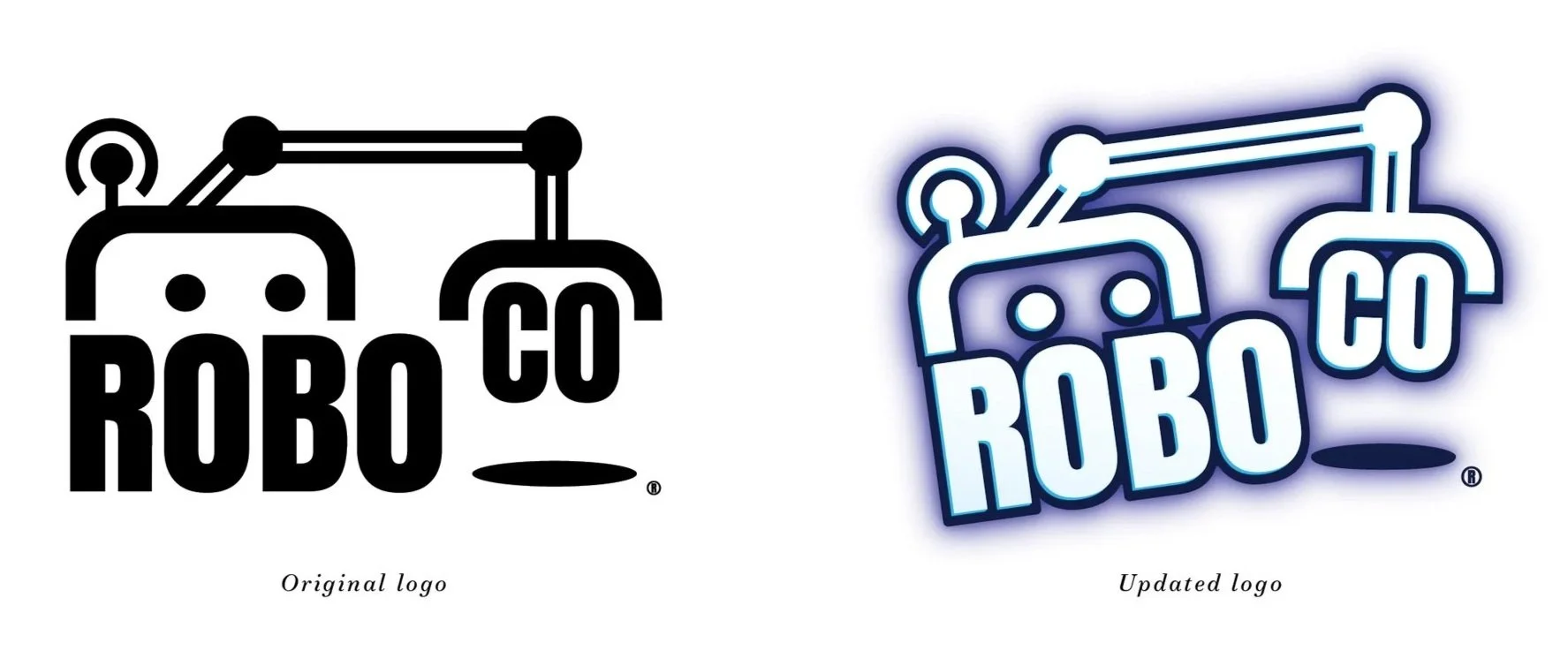
Utilizing existing assets.Early in game development, the team needed a logo for the RoboCo company and created the original logo on the left. The early-access version of the game launched with this logo.
Later, a game artist developed the version on the right. The team felt this version more accurately represented the chaotic nature of the game and would resonate more with the tween target market. The additional depth and shadowing style helped the logo stand out among busy game screens, a common approach in video game logo design.
I was tasked with creating vector and one color versions that could be used in marketing materials.
Robot Champions - the roblox version.
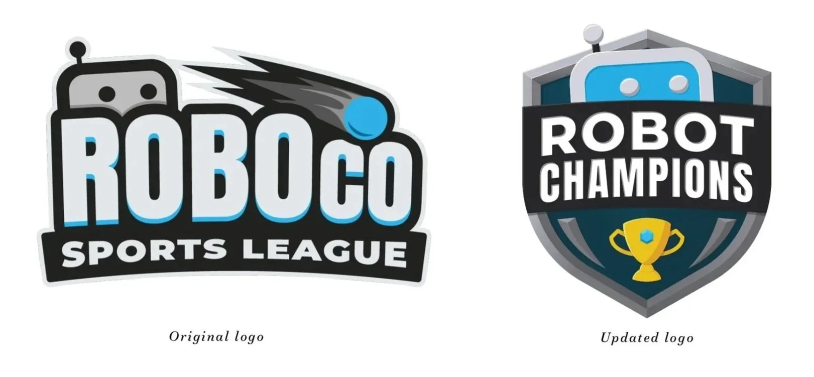
a logo lost.An opportunity arose to translate the robot building experience into a free-to-play game on Roblox. Initially it beta-launched as RoboCo Sports League to reflect it’s relationship to our original RoboCo PC game, we learned that Roblox players were unlikely to try a game when they didn’t understand what it was about.
Therefore, RoboCo Sports League was rebranded to Robot Champions before the game officially launched to help with player education.
The original logo felt like it captured the spirit of the game. While I had hoped we could keep the feeling of the original logo in the update, research into the Roblox market changed the overall direction of the brand and marketing.
Some assembly required - the vr game.
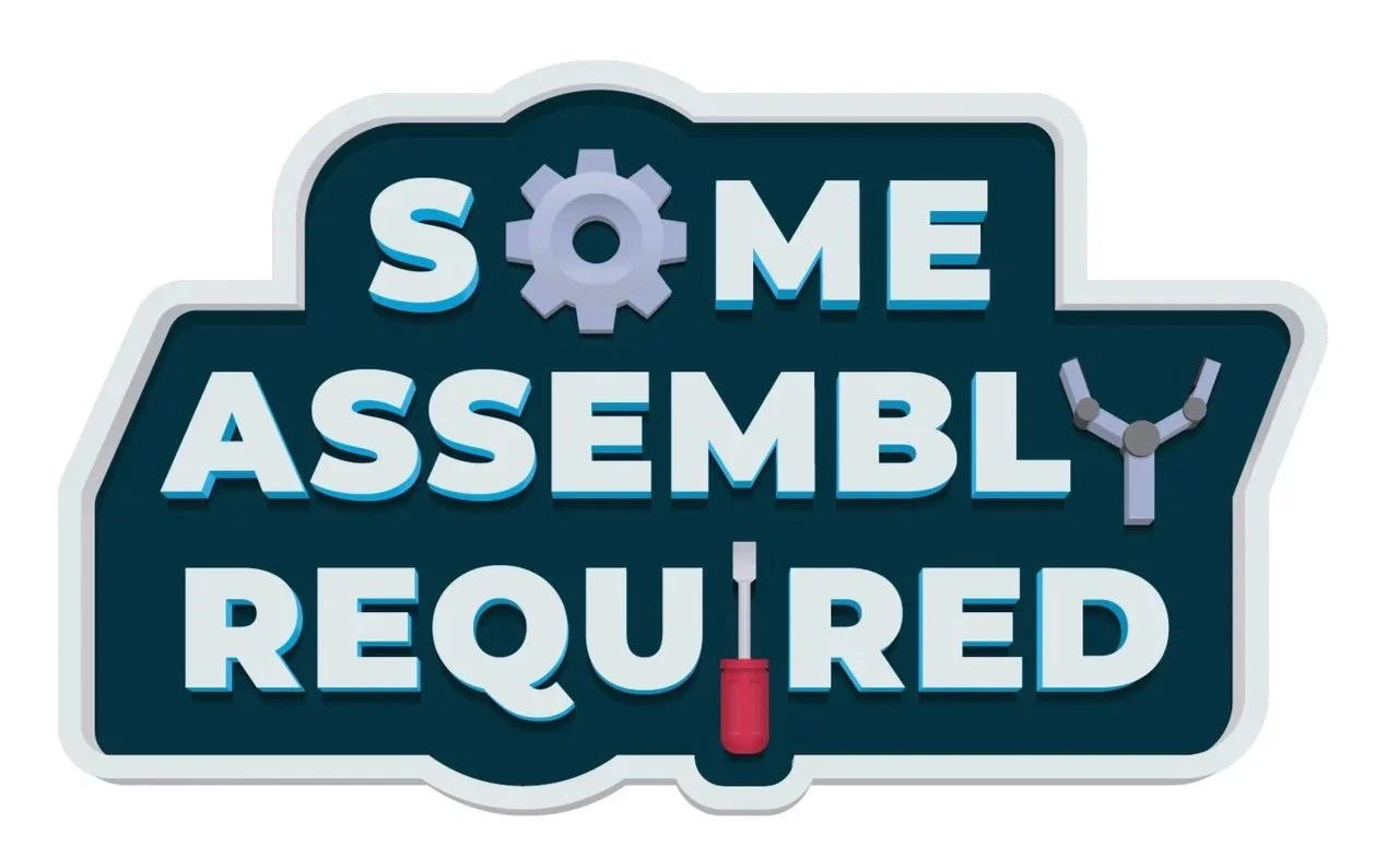
Learning from our market.After launching the game in multiple ways, we learned that the name did not help players understand what they would be doing. The game was rebranded for a VR-version to focus on the robot-building aspects of the experience.
The elements used within the logo are stylized versions of items in the game. The depth and styling reflect the needs of a video game logo, which are different than a general logo. However, we still had to create a one-color version for marketing materials, when a heavily designed logo couldn’t be used.